Interactive Demo
Experience our platform
Click on the hotspots to explore features
Step 1 of 3
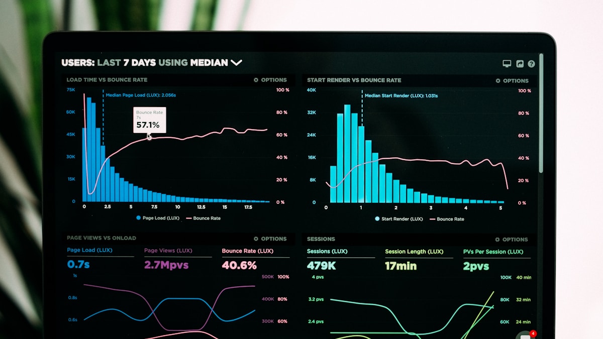
Analytics Dashboard
Get a complete overview of your business metrics with real-time data visualization and customizable widgets.
Installation
Install dependencies
npm install framer-motion lucide-reactCopy and paste the following code into your project.
"use client";

import React, { useState } from "react";
import { motion, AnimatePresence } from "framer-motion";
import { X, ChevronRight, Sparkles } from "lucide-react";

interface Hotspot {
  id: string;
  x: number;
  y: number;
  title: string;
  description: string;
  icon?: React.ElementType;
}

interface DemoStep {
  id: string;
  title: string;
  description: string;
  image: string;
  hotspots: Hotspot[];
}

interface InteractiveDemoProps {
  title?: string;
  description?: string;
  steps: DemoStep[];
  className?: string;
}

export function InteractiveDemo({
  title = "Experience our platform",
  description = "Click on the hotspots to explore features",
  steps,
  className = "",
}: InteractiveDemoProps) {
  const [currentStep, setCurrentStep] = useState(0);
  const [selectedHotspot, setSelectedHotspot] = useState<string | null>(null);

  const currentStepData = steps[currentStep];
  const selectedHotspotData = currentStepData.hotspots.find(
    (h) => h.id === selectedHotspot,
  );

  const handleHotspotClick = (hotspotId: string) => {
    setSelectedHotspot(selectedHotspot === hotspotId ? null : hotspotId);
  };

  return (
    <section className={`relative w-full overflow-hidden py-24 ${className}`}>
      <div className="absolute inset-0 bg-gradient-to-br from-orange-50 via-amber-50 to-rose-50 dark:from-zinc-950 dark:via-orange-950/5 dark:to-rose-950/10" />

      <div className="relative mx-auto max-w-7xl px-4 sm:px-6 lg:px-8">
        <motion.div
          initial={{ opacity: 0, y: 20 }}
          animate={{ opacity: 1, y: 0 }}
          transition={{ duration: 0.6, ease: "easeOut" }}
          className="mb-16 text-center"
        >
          <div className="mb-4 inline-flex items-center gap-2 rounded-full border border-orange-200/50 bg-gradient-to-r from-orange-50 to-rose-50 px-4 py-1.5 text-sm font-semibold text-orange-700 backdrop-blur-sm dark:border-orange-800/50 dark:from-orange-950/50 dark:to-rose-950/50 dark:text-orange-300">
            <Sparkles className="h-4 w-4" />
            Interactive Demo
          </div>
          <h2 className="mb-4 text-5xl font-bold tracking-tight text-zinc-900 dark:text-white lg:text-6xl">
            {title}
          </h2>
          <p className="mx-auto max-w-2xl text-lg text-zinc-600 dark:text-zinc-400">
            {description}
          </p>
        </motion.div>

        <motion.div
          initial={{ opacity: 0, y: 20 }}
          animate={{ opacity: 1, y: 0 }}
          transition={{ duration: 0.6, delay: 0.1, ease: "easeOut" }}
          className="mb-12 flex justify-center"
        >
          <div className="inline-flex gap-2 rounded-2xl border border-zinc-200/80 bg-white/80 p-2 shadow-lg backdrop-blur-xl dark:border-zinc-800/80 dark:bg-zinc-900/80">
            {steps.map((step, index) => (
              <button
                key={step.id}
                onClick={() => {
                  setCurrentStep(index);
                  setSelectedHotspot(null);
                }}
                className={`relative overflow-hidden rounded-xl px-6 py-3 font-semibold transition-all duration-300 ${
                  index === currentStep
                    ? "text-white"
                    : "text-zinc-700 hover:bg-zinc-100 dark:text-zinc-300 dark:hover:bg-zinc-800"
                }`}
              >
                {index === currentStep && (
                  <motion.div
                    layoutId="activeStep"
                    className="absolute inset-0 bg-gradient-to-r from-orange-500 via-amber-500 to-rose-500"
                    transition={{ type: "spring", bounce: 0.2, duration: 0.6 }}
                  />
                )}
                <span className="relative z-10">{step.title}</span>
              </button>
            ))}
          </div>
        </motion.div>

        <motion.div
          initial={{ opacity: 0, y: 30 }}
          animate={{ opacity: 1, y: 0 }}
          transition={{ duration: 0.7, delay: 0.2, ease: "easeOut" }}
        >
          <div className="relative overflow-hidden rounded-3xl border border-zinc-200/80 bg-white/80 shadow-2xl backdrop-blur-xl dark:border-zinc-800/80 dark:bg-zinc-900/80">
            <AnimatePresence mode="wait">
              <motion.div
                key={currentStep}
                initial={{ opacity: 0, x: 20 }}
                animate={{ opacity: 1, x: 0 }}
                exit={{ opacity: 0, x: -20 }}
                transition={{ duration: 0.4, ease: [0.32, 0.72, 0, 1] }}
              >
                {/* Demo Image with Hotspots */}
                <div className="relative aspect-video w-full overflow-hidden bg-zinc-100 dark:bg-zinc-900">
                  <img
                    src={currentStepData.image}
                    alt={currentStepData.title}
                    className="h-full w-full object-cover"
                  />

                  {currentStepData.hotspots.map((hotspot, index) => {
                    const HotspotIcon = hotspot.icon;
                    const isActive = selectedHotspot === hotspot.id;

                    return (
                      <motion.button
                        key={hotspot.id}
                        initial={{ scale: 0, opacity: 0 }}
                        animate={{ scale: 1, opacity: 1 }}
                        transition={{
                          delay: 0.2 + index * 0.1,
                          duration: 0.5,
                          ease: "easeOut",
                        }}
                        onClick={() => handleHotspotClick(hotspot.id)}
                        className="group absolute"
                        style={{
                          left: `${hotspot.x}%`,
                          top: `${hotspot.y}%`,
                          transform: "translate(-50%, -50%)",
                        }}
                      >
                        {/* Animated Ring */}
                        <motion.div
                          className="absolute inset-0 rounded-full"
                          animate={{
                            scale: [1, 1.4, 1],
                            opacity: [0.6, 0, 0.6],
                          }}
                          transition={{
                            duration: 2,
                            repeat: Infinity,
                            ease: "easeInOut",
                          }}
                        >
                          <div className="h-full w-full rounded-full bg-gradient-to-r from-orange-500 to-rose-500" />
                        </motion.div>
                        <div
                          className={`relative flex h-14 w-14 items-center justify-center rounded-full border-2 shadow-xl transition-all duration-300 ${
                            isActive
                              ? "scale-110 border-orange-500 bg-gradient-to-br from-orange-500 to-rose-500"
                              : "border-white bg-white/95 backdrop-blur-md group-hover:scale-110 group-hover:border-orange-400 group-hover:bg-gradient-to-br group-hover:from-orange-500 group-hover:to-rose-500"
                          }`}
                        >
                          {HotspotIcon ? (
                            React.createElement(HotspotIcon, {
                              className: `h-6 w-6 transition-colors ${
                                isActive
                                  ? "text-white"
                                  : "text-orange-600 group-hover:text-white"
                              }`,
                            })
                          ) : (
                            <div
                              className={`h-4 w-4 rounded-full ${
                                isActive
                                  ? "bg-white"
                                  : "bg-orange-600 group-hover:bg-white"
                              }`}
                            />
                          )}
                        </div>
                        <div className="absolute -right-1.5 -top-1.5 flex h-6 w-6 items-center justify-center rounded-full bg-gradient-to-br from-orange-600 to-rose-600 text-xs font-bold text-white shadow-lg">
                          {index + 1}
                        </div>
                      </motion.button>
                    );
                  })}
                </div>

                <div className="border-t border-zinc-200/50 bg-gradient-to-br from-white/50 to-zinc-50/50 p-8 backdrop-blur-sm dark:border-zinc-800/50 dark:from-zinc-900/50 dark:to-zinc-950/50 lg:p-12">
                  <AnimatePresence mode="wait">
                    {selectedHotspotData ? (
                      <motion.div
                        key={selectedHotspotData.id}
                        initial={{ opacity: 0, y: 10 }}
                        animate={{ opacity: 1, y: 0 }}
                        exit={{ opacity: 0, y: -10 }}
                        transition={{ duration: 0.3, ease: "easeOut" }}
                        className="relative"
                      >
                        <button
                          onClick={() => setSelectedHotspot(null)}
                          className="absolute right-0 top-0 rounded-lg p-2 text-zinc-400 transition-colors hover:bg-zinc-100 hover:text-zinc-900 dark:hover:bg-zinc-800 dark:hover:text-white"
                        >
                          <X className="h-5 w-5" />
                        </button>
                        <div className="mb-3 inline-flex items-center gap-2 rounded-full bg-gradient-to-r from-orange-100 to-rose-100 px-3 py-1 text-sm font-semibold text-orange-700 dark:from-orange-950/50 dark:to-rose-950/50 dark:text-orange-300">
                          Feature Highlight
                        </div>
                        <h3 className="mb-3 text-3xl font-bold text-zinc-900 dark:text-white">
                          {selectedHotspotData.title}
                        </h3>
                        <p className="max-w-3xl text-lg leading-relaxed text-zinc-600 dark:text-zinc-400">
                          {selectedHotspotData.description}
                        </p>
                      </motion.div>
                    ) : (
                      <motion.div
                        key="default"
                        initial={{ opacity: 0, y: 10 }}
                        animate={{ opacity: 1, y: 0 }}
                        exit={{ opacity: 0, y: -10 }}
                        transition={{ duration: 0.3, ease: "easeOut" }}
                      >
                        <div className="mb-3 inline-flex items-center gap-2 rounded-full bg-gradient-to-r from-orange-100 to-rose-100 px-3 py-1 text-sm font-semibold text-orange-700 dark:from-orange-950/50 dark:to-rose-950/50 dark:text-orange-300">
                          Step {currentStep + 1} of {steps.length}
                        </div>
                        <h3 className="mb-3 text-3xl font-bold text-zinc-900 dark:text-white">
                          {currentStepData.title}
                        </h3>
                        <p className="max-w-3xl text-lg leading-relaxed text-zinc-600 dark:text-zinc-400">
                          {currentStepData.description}
                        </p>
                      </motion.div>
                    )}
                  </AnimatePresence>
                </div>
              </motion.div>
            </AnimatePresence>
          </div>
        </motion.div>
        <motion.div
          initial={{ opacity: 0, y: 20 }}
          animate={{ opacity: 1, y: 0 }}
          transition={{ duration: 0.6, delay: 0.3, ease: "easeOut" }}
          className="mt-12 grid gap-4 sm:grid-cols-2 lg:grid-cols-3"
        >
          {currentStepData.hotspots.map((hotspot, index) => {
            const HotspotIcon = hotspot.icon;
            const isActive = selectedHotspot === hotspot.id;

            return (
              <motion.button
                key={hotspot.id}
                initial={{ opacity: 0, y: 20 }}
                animate={{ opacity: 1, y: 0 }}
                transition={{
                  delay: 0.4 + index * 0.08,
                  duration: 0.4,
                  ease: "easeOut",
                }}
                onClick={() => handleHotspotClick(hotspot.id)}
                className={`group relative overflow-hidden rounded-2xl border p-6 text-left transition-all duration-300 ${
                  isActive
                    ? "border-orange-500 bg-gradient-to-br from-orange-50 to-rose-50 shadow-lg shadow-orange-500/20 dark:border-orange-600 dark:from-orange-950/30 dark:to-rose-950/30"
                    : "border-zinc-200 bg-white hover:border-orange-200 hover:shadow-lg dark:border-zinc-800 dark:bg-zinc-900 dark:hover:border-orange-900"
                }`}
              >
                <div className="mb-4 flex items-center gap-3">
                  {HotspotIcon && (
                    <div
                      className={`flex h-12 w-12 items-center justify-center rounded-xl transition-all duration-300 ${
                        isActive
                          ? "bg-gradient-to-br from-orange-500 to-rose-500 text-white shadow-lg shadow-orange-500/30"
                          : "bg-zinc-100 text-zinc-600 group-hover:bg-gradient-to-br group-hover:from-orange-500 group-hover:to-rose-500 group-hover:text-white group-hover:shadow-lg group-hover:shadow-orange-500/30 dark:bg-zinc-800 dark:text-zinc-400"
                      }`}
                    >
                      {React.createElement(HotspotIcon, {
                        className: "h-6 w-6",
                      })}
                    </div>
                  )}
                  <span className="flex h-7 w-7 items-center justify-center rounded-full bg-gradient-to-br from-orange-600 to-rose-600 text-sm font-bold text-white shadow-md">
                    {index + 1}
                  </span>
                </div>
                <h4 className="mb-2 font-bold text-zinc-900 dark:text-white">
                  {hotspot.title}
                </h4>
                <p className="text-sm leading-relaxed text-zinc-600 dark:text-zinc-400">
                  {hotspot.description}
                </p>
                <ChevronRight
                  className={`absolute bottom-6 right-6 h-5 w-5 transition-all duration-300 ${
                    isActive
                      ? "translate-x-0 text-orange-600 opacity-100"
                      : "translate-x-2 text-zinc-400 opacity-0 group-hover:translate-x-0 group-hover:text-orange-600 group-hover:opacity-100"
                  }`}
                />
              </motion.button>
            );
          })}
        </motion.div>
      </div>
    </section>
  );
}Features
- ✅ Interactive hotspots - Large, pulsing hotspots with numbered badges
- ✅ Multiple demo steps - Pill-style tab navigation between views
- ✅ Smooth animations - Natural, eased transitions between steps
- ✅ Feature cards grid - Clickable cards with chevron indicators
- ✅ Warm color palette - Orange/amber/rose gradient theme
- ✅ Glassmorphism design - Frosted glass effects with backdrop blur
- ✅ Clean layout - Focused, distraction-free interface
- ✅ Responsive design - Works beautifully on all screen sizes
- ✅ Dark mode ready - Elegant in both light and dark themes
- ✅ TypeScript support - Full type safety
Usage
Basic Usage
import InteractiveDemo from "@/components/ui/interactive-demo";
import {BarChart3, Users, Zap} from "lucide-react";

const demoSteps = [
  {
    id: "dashboard",
    title: "Analytics Dashboard",
    description: "Get a complete overview of your business metrics.",
    image:
      "https://images.unsplash.com/photo-1551288049-bebda4e38f71?w=1200&h=675",
    hotspots: [
      {
        id: "charts",
        x: 25, // Percentage from left
        y: 40, // Percentage from top
        title: "Real-time Charts",
        description: "Interactive charts that update in real-time.",
        icon: BarChart3,
      },
      {
        id: "metrics",
        x: 75,
        y: 35,
        title: "Key Metrics",
        description: "Track your most important KPIs at a glance.",
        icon: Users,
      },
    ],
  },
];

export default function Page() {
  return <InteractiveDemo steps={demoSteps} />;
}Custom Title and Description
<InteractiveDemo
  title="See it in action"
  description="Explore our features with interactive hotspots"
  steps={demoSteps}
/>Props
InteractiveDemoProps
| Prop | Type | Default | Description |
|---|---|---|---|
steps | DemoStep[] | Required | Array of demo steps |
title | string | "Experience our platform" | Section title |
description | string | "Click on the hotspots..." | Section description |
className | string | "" | Additional CSS classes |
DemoStep
| Prop | Type | Required | Description |
|---|---|---|---|
id | string | Yes | Unique identifier |
title | string | Yes | Step title |
description | string | Yes | Step description |
image | string | Yes | Image URL for the demo view |
hotspots | Hotspot[] | Yes | Array of interactive hotspots |
Hotspot
| Prop | Type | Required | Description |
|---|---|---|---|
id | string | Yes | Unique identifier |
x | number | Yes | Position from left (percentage) |
y | number | Yes | Position from top (percentage) |
title | string | Yes | Hotspot title |
description | string | Yes | Hotspot description |
icon | React.ElementType | No | Lucide React icon component |
TypeScript Interface
interface Hotspot {
  id: string;
  x: number; // Percentage from left (0-100)
  y: number; // Percentage from top (0-100)
  title: string;
  description: string;
  icon?: React.ElementType;
}

interface DemoStep {
  id: string;
  title: string;
  description: string;
  image: string;
  hotspots: Hotspot[];
}

interface InteractiveDemoProps {
  title?: string;
  description?: string;
  steps: DemoStep[];
  className?: string;
}Use Cases
Perfect for:
- SaaS product demos
- Feature showcases
- Interactive tutorials
- Product walkthroughs
- Landing page demos
- Sales presentations
- Onboarding flows
- Marketing pages
Positioning Hotspots
Hotspots use percentage-based positioning:
{
  x: 25, // 25% from left edge
  y: 40, // 40% from top edge
}Tips for Positioning:
- Use a grid overlay - Temporarily add a grid to your image
- Test on different sizes - Ensure hotspots work on mobile
- Avoid edges - Keep hotspots at least 10% from edges
- Group related features - Place related hotspots near each other
- Use visual hierarchy - Number hotspots in logical order
Example Positions:
// Top-left quadrant
{x: 25, y: 25}

// Top-right quadrant
{x: 75, y: 25}

// Center
{x: 50, y: 50}

// Bottom-left quadrant
{x: 25, y: 75}

// Bottom-right quadrant
{x: 75, y: 75}Customization
Change Color Scheme
// Replace orange/rose gradients with your brand colors
// Example: Change to blue/purple

// Step navigation active state
className = "bg-gradient-to-r from-blue-500 via-indigo-500 to-purple-500";

// Hotspot active state
className = "bg-gradient-to-br from-blue-500 to-purple-500";

// Number badges
className = "bg-gradient-to-br from-blue-600 to-purple-600";

// Feature card active state
className = "border-blue-500 bg-gradient-to-br from-blue-50 to-purple-50";

// Background
className = "bg-gradient-to-br from-blue-50 via-indigo-50 to-purple-50";Adjust Hotspot Size
// Make hotspots larger or smaller
<div className="relative flex h-16 w-16 items-center justify-center rounded-full">
  {/* Larger: h-16 w-16 */}
  {/* Default: h-14 w-14 */}
  {/* Smaller: h-12 w-12 */}
</div>Change Animation Speed
// Modify transition durations for faster/slower animations
transition={{duration: 0.6, ease: "easeOut"}} // Slower
transition={{duration: 0.3, ease: "easeOut"}} // Faster

// Adjust hotspot appearance delay
transition={{
  delay: 0.3 + index * 0.15, // Slower stagger
  duration: 0.5,
  ease: "easeOut",
}}Remove Feature Cards Grid
// If you only want the demo without the feature cards below
// Simply remove or comment out the feature grid section:

{
  /* Feature Grid */
}
{
  /* <motion.div className="mt-12 grid gap-4...">
  ...
</motion.div> */
}Add Step Counter
// Add a step counter to the header
<div className="mb-4 text-center">
  <span className="text-sm font-medium text-zinc-600">
    Step {currentStep + 1} of {steps.length}
  </span>
</div>Common Patterns
Dashboard Demo
const dashboardSteps = [
  {
    id: "overview",
    title: "Dashboard Overview",
    description: "Your command center for all business metrics.",
    image: "/demo/dashboard.png",
    hotspots: [
      {
        id: "revenue",
        x: 20,
        y: 30,
        title: "Revenue Tracking",
        description: "Monitor revenue in real-time with detailed breakdowns.",
        icon: DollarSign,
      },
      {
        id: "users",
        x: 50,
        y: 30,
        title: "User Analytics",
        description: "Track user growth, engagement, and retention.",
        icon: Users,
      },
      {
        id: "performance",
        x: 80,
        y: 30,
        title: "Performance Metrics",
        description: "Monitor system health and performance.",
        icon: Activity,
      },
    ],
  },
];Mobile App Demo
const mobileSteps = [
  {
    id: "home",
    title: "Home Screen",
    description: "Beautiful, intuitive interface designed for mobile.",
    image: "/demo/mobile-home.png",
    hotspots: [
      {
        id: "nav",
        x: 50,
        y: 90,
        title: "Bottom Navigation",
        description: "Easy thumb-friendly navigation.",
        icon: Menu,
      },
      {
        id: "search",
        x: 50,
        y: 15,
        title: "Smart Search",
        description: "Find anything instantly with AI-powered search.",
        icon: Search,
      },
    ],
  },
];Feature Comparison Demo
const comparisonSteps = [
  {
    id: "before",
    title: "Before",
    description: "The old way of doing things.",
    image: "/demo/before.png",
    hotspots: [
      {
        id: "slow",
        x: 30,
        y: 50,
        title: "Slow Process",
        description: "Manual work that takes hours.",
        icon: Clock,
      },
    ],
  },
  {
    id: "after",
    title: "After",
    description: "The new way with our platform.",
    image: "/demo/after.png",
    hotspots: [
      {
        id: "fast",
        x: 30,
        y: 50,
        title: "Instant Results",
        description: "Automated process that takes seconds.",
        icon: Zap,
      },
    ],
  },
];Best Practices
Content Guidelines
- Limit hotspots - 3-5 hotspots per step is ideal
- Clear titles - Use concise, descriptive titles
- Benefit-focused - Explain the value, not just the feature
- Consistent numbering - Number hotspots in logical order
- High-quality images - Use actual product screenshots
UX Guidelines
- Visible hotspots - Ensure hotspots stand out with pulse animation
- Logical flow - Order steps in a natural progression
- Mobile-friendly - Test hotspot sizes on mobile devices (14x14 works well)
- Quick to explore - Users should understand in 30 seconds
- Clear numbering - Number hotspots in the order users should explore them
Image Guidelines
Recommended Specs:
- Format: PNG or WebP
- Size: 1200x675px (16:9 ratio)
- Quality: High resolution for clarity
- Content: Actual product screenshots
- Annotations: Avoid pre-annotated images (hotspots do this)
Tools:
- Screenshot: CleanShot X
- Editing: Figma
- Optimization: Squoosh
- Mockups: Shots.so
Design Details
Color Palette
The component uses a warm, inviting gradient palette:
- Primary gradient: Orange-500 → Amber-500 → Rose-500
- Backgrounds: Orange-50 → Amber-50 → Rose-50
- Hotspots: Orange-500 → Rose-500
- Number badges: Orange-600 → Rose-600
- Accents: Warm orange tones throughout
Animation System
All animations use natural easing curves:
- Easing:
easeOutfor smooth deceleration - Duration: 0.3-0.6s depending on element
- Staggered delays: Sequential reveals for polish
- Pulse animation: 2s infinite loop on hotspots
Layout Philosophy
The design prioritizes clarity and focus:
- Minimal chrome: No unnecessary controls or UI elements
- Generous spacing: Breathing room between elements
- Clear hierarchy: Visual weight guides attention
- Glassmorphism: Subtle backdrop blur for depth
Accessibility
The component includes:
- Keyboard navigation - Tab through hotspots and step tabs
- ARIA labels - Descriptive labels for screen readers
- Focus indicators - Clear focus states on interactive elements
- Semantic HTML - Proper heading hierarchy
- Alt text - Images have descriptive alt attributes
- Color contrast - WCAG AA compliant text contrast
Analytics Integration
const handleHotspotClick = (hotspotId: string, stepId: string) => {
  // Track hotspot interactions
  analytics.track("demo_hotspot_clicked", {
    hotspot_id: hotspotId,
    step_id: stepId,
    timestamp: Date.now(),
  });
};

const handleStepChange = (stepIndex: number) => {
  // Track step views
  analytics.track("demo_step_viewed", {
    step_index: stepIndex,
    step_id: steps[stepIndex].id,
  });
};Examples
Complete SaaS Demo
const saasDemo = [
  {
    id: "dashboard",
    title: "Analytics Dashboard",
    description: "Real-time insights into your business.",
    image: "/demo/dashboard.png",
    hotspots: [
      {
        id: "charts",
        x: 25,
        y: 40,
        title: "Interactive Charts",
        description: "Visualize your data with beautiful charts.",
        icon: BarChart3,
      },
      {
        id: "filters",
        x: 75,
        y: 20,
        title: "Advanced Filters",
        description: "Drill down into any metric.",
        icon: Filter,
      },
      {
        id: "export",
        x: 85,
        y: 15,
        title: "Export Data",
        description: "Download reports in any format.",
        icon: Download,
      },
    ],
  },
  {
    id: "collaboration",
    title: "Team Collaboration",
    description: "Work together seamlessly.",
    image: "/demo/team.png",
    hotspots: [
      {
        id: "chat",
        x: 70,
        y: 50,
        title: "Built-in Chat",
        description: "Communicate without leaving the app.",
        icon: MessageSquare,
      },
      {
        id: "sharing",
        x: 30,
        y: 40,
        title: "Easy Sharing",
        description: "Share dashboards with one click.",
        icon: Share2,
      },
    ],
  },
];